# Developing theme plugins
Theme plugins provide SCSS styles to customize the appearance of GROWI. We recommend developing with SCSS and transpiling with Vite.
For the basic workflow of plugin development, please also refer to Plugin development basics.
# Basic structure of theme plugins
A typical theme plugin has the following structure:
growi-plugin-theme-example/
├── package.json             # Plugin information and dependencies
├── src/                     # Source code
│   └── styles/              # Styles directory
│       └── style.scss       # Main style file
├── tsconfig.json            # TypeScript configuration (if needed)
└── vite.config.ts           # Build configuration
# Examples of actual plugin structures
# Development process
# 1. Create package.json
Create a package.json file and include the growiPlugin directive.
In this tutorial, we'll first set the three properties: name, manifestKey, and schemeType. You can use the sample values for preview display colors (lightBg, darkBg, lightSidebar, etc.) to proceed. These values can be adjusted as needed when your theme development progresses.
For details on each property, please refer to Detailed properties for theme plugins.
{
  "name": "growi-plugin-theme-example", // Plugin name
  "version": "1.0.0",
  "description": "Example GROWI theme plugin", // Plugin description
  "license": "MIT",
  "keywords": [
    "growi",
    "growi-plugin"
  ],
  "main": "dist/libs/index.js",
  "files": ["dist"],
  "scripts": {
    "build": "vite build"
  },
  "devDependencies": {
    "@growi/core-styles": "^1.0.0", // GROWI core styles
    "@growi/pluginkit": "^1.1.0",   // GROWI plugin development kit
    "bootstrap": "^x.x.x",
    "sass": "^x.x.x",               // Sass/SCSS compiler
    "vite": "^x.x.x"                // Build tool
  },
  "growiPlugin": {
    "schemaVersion": "4",
    "types": ["theme"],             // Multiple plugin types can be set simultaneously
    "themes": [
      {
        "name": "my-theme",         // Theme name
        "manifestKey": "src/styles/style.scss",  // Style entry point
        "schemeType": "light",      // Theme scheme type (light/dark/both)
        "lightBg": "#ffffff",       // The following are all settings for preview display in the admin screen (do not affect actual appearance)
        "darkBg": "#121212",
        "lightSidebar": "#f5f5f5",
        "darkSidebar": "#333333",
        "lightIcon": "#4a4a4a",
        "darkIcon": "#e0e0e0",
        "createBtn": "#00acee"
      }
    ]
  }
}
# 2. Install libraries
$ pnpm install
# 3. Create SCSS file
Create src/styles/style.scss. For now, just create this file, and the actual style implementation will be explained in detail in Implement styles.
# 4. Vite configuration
Configure the build settings in the vite.config.ts file.
// vite.config.ts
import { defineConfig } from 'vite';
export default defineConfig({
  build: {
    manifest: true,
    rollupOptions: {
      input: ['/src/styles/style.scss'],
    },
  },
});
# 5. Add tests (optional)
You can add tests to verify that your plugin configuration is correct. To implement tests, create test/index.spec.ts.
Here's an example of a test based on growi-plugin-theme-vivid-internet (opens new window):
import * as path from 'node:path';
// Import the theme plugin validation function from the @growi/pluginkit package
import { validateThemePluginGrowiDirective } from '@growi/pluginkit/dist/v4/server';
describe('package.json', () => {
  test('should pass validation', () => {
    // Get the project root directory path
    const projectDirRoot = path.resolve(__dirname, '..');
    // Use the pluginkit validation function to verify the theme plugin configuration
    // This function automatically reads and validates the growiPlugin configuration in package.json
    const result = validateThemePluginGrowiDirective(projectDirRoot);
    // Verify that there is at least one theme configuration in the validation result
    // This confirms that growiPlugin.themes is correctly configured in package.json
    expect(result.themes.length).toBeGreaterThan(0);
  });
});
To run this test, add a test script to package.json:
"scripts": {
  "build": "vite build",
  "test": "vitest run"
},
"devDependencies": {
  // In addition to existing dependencies
  "vitest": "^x.x.x"
}
Running the pnpm test command will automatically validate that your plugin configuration in package.json is correct.
# 6. Build the plugin
$ pnpm build
This generates the built files in the dist directory. Your theme plugin is now ready to be used in GROWI.
# 7. Implement styles
Now, implement the theme styles in the src/styles/style.scss file you created earlier.
The following official theme plugin example can be helpful:
The basic SCSS structure is as follows:
:root[data-bs-theme] {
  // Import GROWI core styles
  @import '@growi/core-styles/scss/bootstrap/init-stage-1';
  @import '@growi/core-styles/scss/bootstrap/theming/variables';
  @import '@growi/core-styles/scss/bootstrap/theming/utils/color-palette';
  // Define custom colors
  $primary: #0066cc;
  $highlight: #ff6600;
  $secondary: #666666;
  // Generate color palettes
  @include generate-color-palette('primary', $primary, #0000FF, #FF0000, 12.5%, 12.5%);
  @include generate-color-palette('highlight', $highlight,#00FFFF, #FFFF00, 25%, 25%);
  // Set basic style variables
  $body-color: #333333;
  $body-bg: #ffffff;
  // Other settings...
  // Import required Bootstrap variables and GROWI styles
  @import 'bootstrap/scss/variables';
  @import 'bootstrap/scss/variables-dark';
  @import '@growi/core-styles/scss/bootstrap/init-stage-2';
  @import '@growi/core-styles/scss/bootstrap/theming/apply-light';
  // Customize specific GROWI elements
  --grw-sidebar-nav-btn-color: var(--grw-highlight-500);
  // Additional custom styles
  // ...
}
# Key points for theme customization
# 1. Color design
The following color settings are important in GROWI themes:
$primary: The main color (for buttons, active elements, etc.)$highlight: Color for emphasis and selected items$secondary: Color for secondary elements (uses Bootstrap's default value by default, with option to customize as needed)
# 2. Color palette generation
Using the generate-color-palette mixin, you can automatically generate variations of a base color. This enables a consistent design.
@include generate-color-palette($color-id, $color-value, $shade-color, $tint-color, $shade-color-ratio, $tint-color-ratio, $prefix);
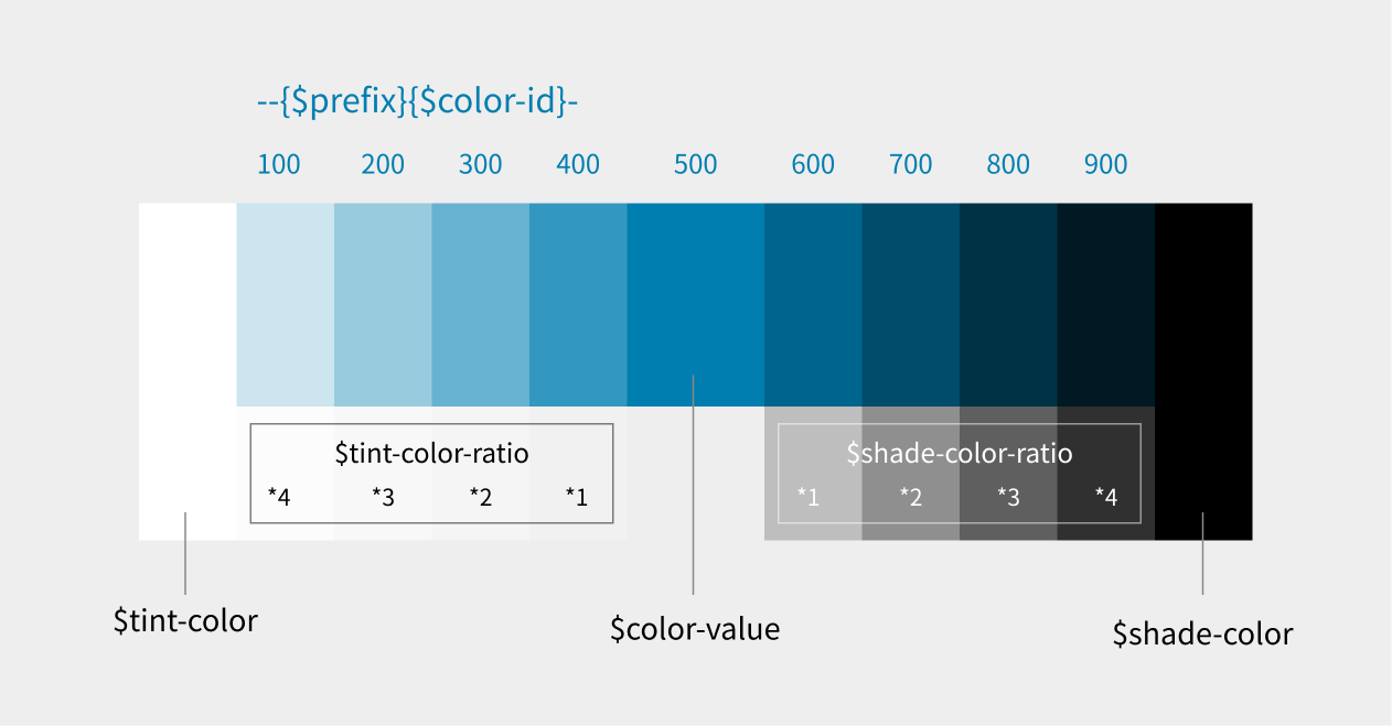
# Parameters
| Parameter | Description | Default Value |
|---|---|---|
$color-id (required) | Identifier for the generated variables (e.g., 'primary') | None |
$color-value (required) | Base color value (e.g., #4285f4) | None |
$shade-color | Color to mix when creating darker colors | black |
$tint-color | Color to mix when creating lighter colors | white |
$shade-color-ratio | Base mixing ratio for creating darker colors | 20% |
$tint-color-ratio | Base mixing ratio for creating lighter colors | 20% |
$prefix | Prefix for generated CSS variables | 'grw-' |
# Generated variables
This mixin generates the following CSS variables:
- Base color:
--{$prefix}{$color-id}-500 - Darker variations:
--{$prefix}{$color-id}-600to--{$prefix}{$color-id}-900 - Lighter variations:
--{$prefix}{$color-id}-400to--{$prefix}{$color-id}-100 - RGB format values:
--{$prefix}{$color-id}-{number}-rgb
# Usage example
@include generate-color-palette('primary', #17B37F, #1E286B, #FAF7DE, 18%, 23%);
This example generates the following CSS variables:
--grw-primary-500: Base color (#17B37F)- Darker color variations:
--grw-primary-600: Base color mixed with 18% of #1E286B--grw-primary-700: Base color mixed with 36% of #1E286B--grw-primary-800: Base color mixed with 54% of #1E286B--grw-primary-900: Base color mixed with 72% of #1E286B
- Lighter color variations:
--grw-primary-400: Base color mixed with 23% of #FAF7DE--grw-primary-300: Base color mixed with 46% of #FAF7DE--grw-primary-200: Base color mixed with 69% of #FAF7DE--grw-primary-100: Base color mixed with 92% of #FAF7DE
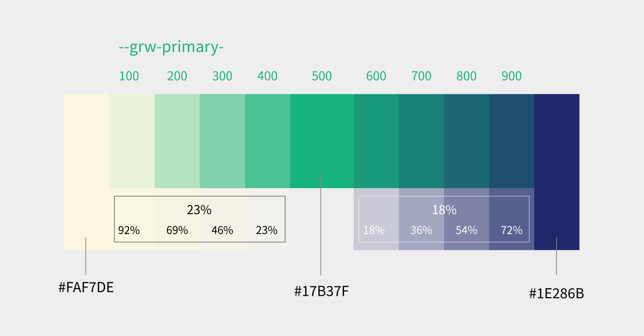
For detailed implementation, refer to _color-palette.scss (opens new window).
# 3. Responsive design
Aim for responsive design that adapts to various device sizes from mobile to desktop. Utilize Bootstrap's grid system and breakpoints.
# 4. Light/Dark mode support
Consider styles for both light and dark modes according to the schemeType setting in package.json.
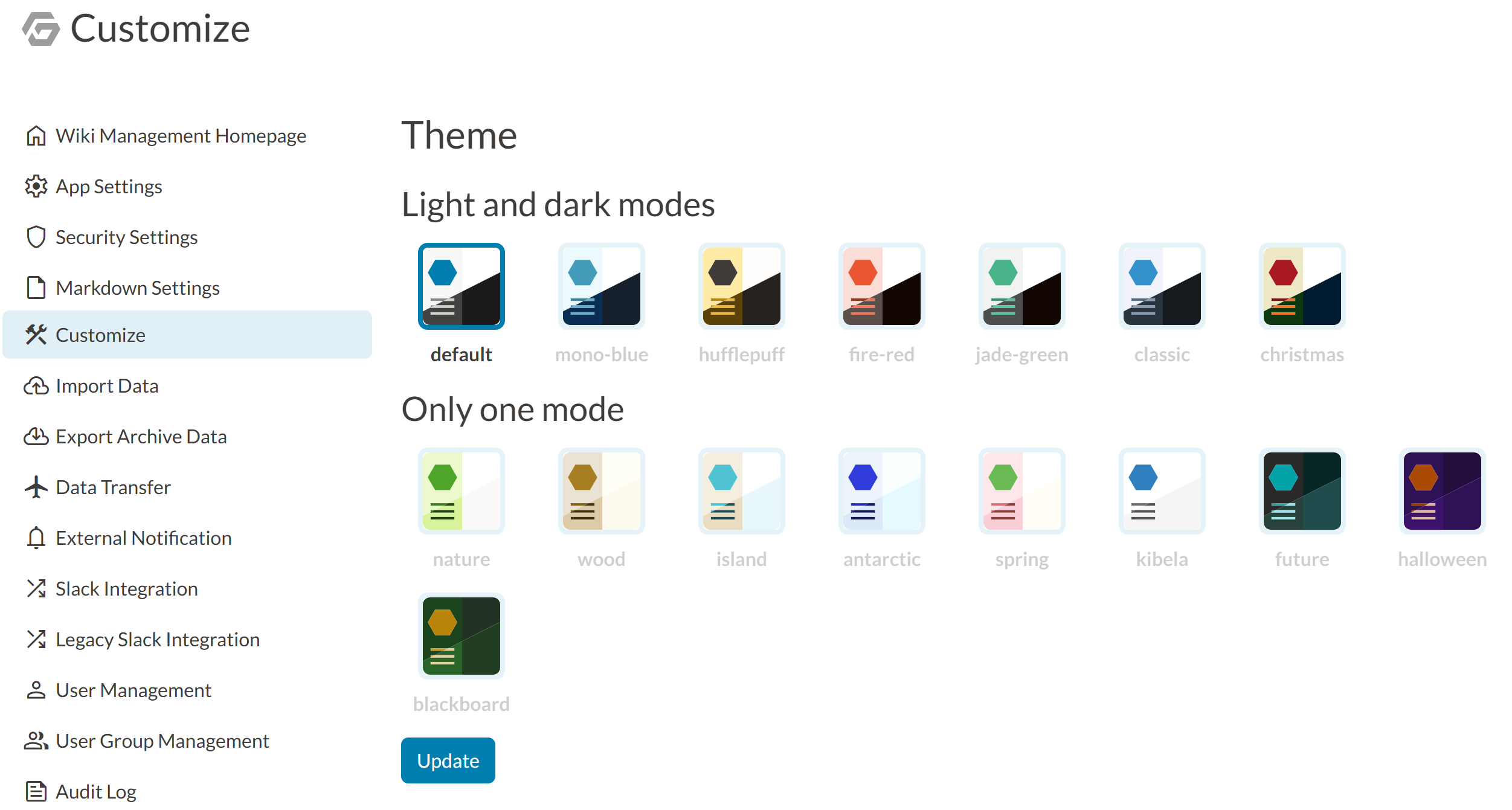
# Detailed properties for theme plugins
Each item in the growiPlugin.themes array in package.json needs to have the following properties. All of these are required.
name:- Identification name for the theme
- String type
- Example:
"my-theme" - Used as an identifier when selecting the theme
manifestKey:- Path to the style file
- String type
- Example:
"src/styles/style.scss" - Specify the SCSS file that will be the source for the actual CSS file
schemeType:- Theme scheme type
- String type
- Valid values:
"light","dark","both"
lightBg:- Background color of the theme preview box in light mode in the admin screen
- Hexadecimal color code (string type)
darkBg:- Background color of the theme preview box in dark mode in the admin screen
- Hexadecimal color code (string type)
lightSidebar:- Sidebar color of the theme preview box in light mode in the admin screen
- Hexadecimal color code (string type)
darkSidebar:- Sidebar color of the theme preview box in dark mode in the admin screen
- Hexadecimal color code (string type)
lightIcon:- Icon color of the theme preview box in light mode in the admin screen
- Hexadecimal color code (string type)
darkIcon:- Icon color of the theme preview box in dark mode in the admin screen
- Hexadecimal color code (string type)
createBtn:- Color of the create button in the theme preview box in the admin screen
- Hexadecimal color code (string type)
The properties lightBg, darkBg, lightSidebar, darkSidebar, lightIcon, darkIcon, and createBtn are only used for the appearance of the theme preview in the theme selection UI in the admin screen and do not affect the actual appearance of the application. The actual style of the application is defined by the style file specified in manifestKey.